My blog for Design (ART 130) covers all the concepts that we learned throughout the semester. Specifically, I represented all of the concepts learned through street art.
Tuesday, October 16, 2012
23. Unity with Variety
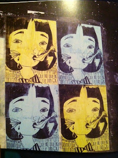
Variety is used to make a difference. It allows something in the art to pop out and not be the same all the way through. This street art is using unity in that it is repeated the same head three times, but it shows variety because the artist does not use all the same looks for the face. Instead the artist uses a variety of effects for the face while actually keeping the outline the same for all three.
22. Unity through Continuity
Continuity refers to the visual relationship between two or more designs. A grid is used by many artists in order to achieve this. Unity through continuity is used in both of these street art examples because of the repetition of their objects in a grid-like pattern.
21. Unity through Continuation
Continuation is when you can tell that something still continues even after you can no longer see it. In both of these street arts the artist creates unity through continuation because the images flow from one side of the builing to the other but at the end it doesn't stop. You can still tell that the image will and can still contine on to the other side of the building or somewhere else.
20. Unity through Repetition
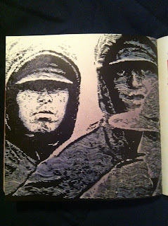
 Unity through repetition uses the same object or pattern over and over again to create a sense of unity. In both of these street arts repetition is depicted. In the right the referees are repeated over which make it show that it is together. With the art below the artist is using the same creature repeatedly in order to show a unity of them and thus creating a larger composition.
19. Unity through Proximity
Unity through proximity is putting objects closely together in order to make them seem unified. This street art is a prime example because all of the televisions are closely piled together making the art unified and compact.
18. Visual Texture
Visual texture is texture that can't actually be felt, but you can see that it would have a texture and you can imagine how it would feel if it were 3D. If you look closely at this street art you will be able to see quite a bit of visual texture. In the humans you can get a sense of what their skin would feel like as well as the testure of their clothing. You can also tell that the tree has visual texture, it looks as if you could actually touch it and feel the rigids. Same with the leaves they also look like they have a texture, but they are more smooth than everything else.
17. Tactile Texture
Tactile texture is texture that you can actually feel with your bare hands. This street art is an example because it is actually made up of tactile pieces that you would be able to feel with your own hands if you were to see it in person, but in the photo you can't really tell that it is tactile.
16. Value as Emphasis
Value as Emphasis is the technique of using light and dark features to contrast and make a focal point. In this street are the artist uses bright, bold colors in the bottom left in contrast to the black and white figures at the top in order to make the lady and the bird his focal point.
15. Value as Pattern
14. Curvilinear Shapes
Curvilinear shapes are ones that contour lines are dominated by curves and are flowing. This street art is an example because of the curves of the womans body. There are not a lot of straight, strict lines that make up this woman. The artist used curvilinear lines to give her womanly features.
13. Rectilinear Shapes
 Rectilinear shape emphasizes right angles and rectangular planes. This street art represents rectilinear shapes because it is composed of many black rectangles. It uses rectangles with sharp, straight edges giving it a crisp look.
Monday, October 15, 2012
12. Nonobjective Shapes
Nonobjective shapes are those that have no object reference and no subject matter suggestion. Both of these street art pieces are good examples because you can not clearly make out any objective items. They are just scattered and randomly placesd lines and shapes not meaning to make up anything particular.
11. Abstraction
Abstraction implies a simplification of natural shapes to their essential basic character. In this street art you can tell that it is suppose to be a face, but it is not shaped like an average face. Instead the artist used abstraction and used shapes to compose the face of this person in an oddly unique way.


10. Idealism
Idealism reproduces the world in the way that it should be seen, not in the way that it actually is. To me this street art represents idealism because it seems to portray what love should be. You should believe in it and it should be intimate. This couple is kissing and they are happy and that's the way that it should be.
9. Distortion

 Distortion is caused when the artist changes or exaggerates the forms of nature. These are both examples of distorition. The first photo is the word "Faith", but at a glance you can not tell what it say immediately. They artist has distorted the word making it harder to interpret. The second photo is ditortion in that the head of the fly is too big for the body and is not proportional.
8. Naturalism
Naturalism is what most people call realism. It is described as "naturalistic". They are images that are proportionate and gives the illusion of volume and three-dimension space. This street art is an example because it literally looks like it is happening. It looks 3D but yet it is on a flat wall.
7. Lost and Found Contour
Lost and Found contour is when only part of the body is revealed by a sharp contour, but the edge disappears into a mysterious darkness. This street art depicts lost and found contour because the womans hair is black and blends in with the house in the background, but on the other side you can distinctly see her features.
6. Line as Value
This street art is composed of entirely lines. What makes the shapes and features in this art is the different values of the lines. Some lines are farther apart to make it more light and others are closer together or completely touching to make it darker in other areas. This is using lines as value.
5. Gesture Lines
In this street art of this bird gesture lines are used to compose its shape. Gesture lines are used when shapes are less important and the edges move freely. If you look closely you can tell that the outline of this bird is not crisp and that it is more rigid with gesture outlines still visible.
4. Contour Line
3. Line as Emotion
The possibilities are endless with lines and one thing that an artist can do with line is evoke emotions. In this modified Scream work the emotion is seen at first glance. The faces immediately evoke an emotion of shock, scared and worried. The wavy lines in the background help to add to this uneasy feeling that these characters may be feeling.
2. Line Direction
Line Direction is an important concept because it can show the feel and movement in a piece. In this piece there are diagonal and straight lines implying movement and activity. The direction of these lines make it seem very active.
1. Line as Shape
Subscribe to:
Posts (Atom)


